
Branding, Copywriting, Strategy, Execution
Led the development of Salt & Lime’s brand identity from the ground up, including logo design, website design, copywriting, photography, and print collateral — unifying digital and physical touchpoints into one cohesive brand experience.
-
Objective: Build a cohesive visual and verbal foundation from the ground up.
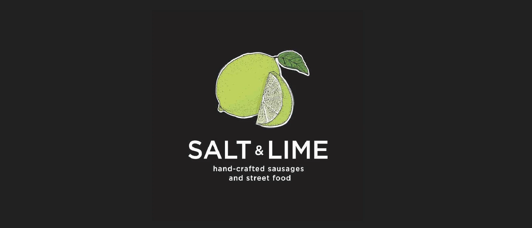
Salt & Lime required a brand identity that felt vibrant, modern, and rooted in its culinary personality. I art directed the logo, established typography and color direction, and defined the tone of voice to ensure consistency across digital and physical touchpoints.
The goal was clarity and memorability: a brand that could stand confidently in a competitive market.
-
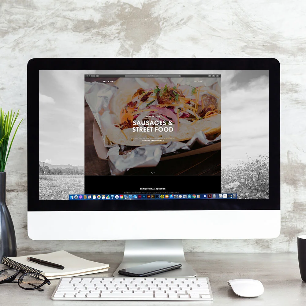
Objective: Create a website that reflects the energy of the brand while driving action.
I designed and built the website to mirror the brand’s visual language and atmosphere. Layout, imagery, and copy were structured to feel inviting and intuitive, while clearly guiding users toward key actions (menu exploration, reservations, contact, etc.).
The site wasn’t just informational, it reinforced brand personality.
-
Objective: Move beyond generic restaurant copy.
I wrote all website and brand copy to reflect Salt & Lime’s voice: spicy, confident, and distinct. Messaging focused on experience and atmosphere as much as offerings, ensuring the brand felt lived-in rather than templated.
Strong copy turned visual identity into story.
-
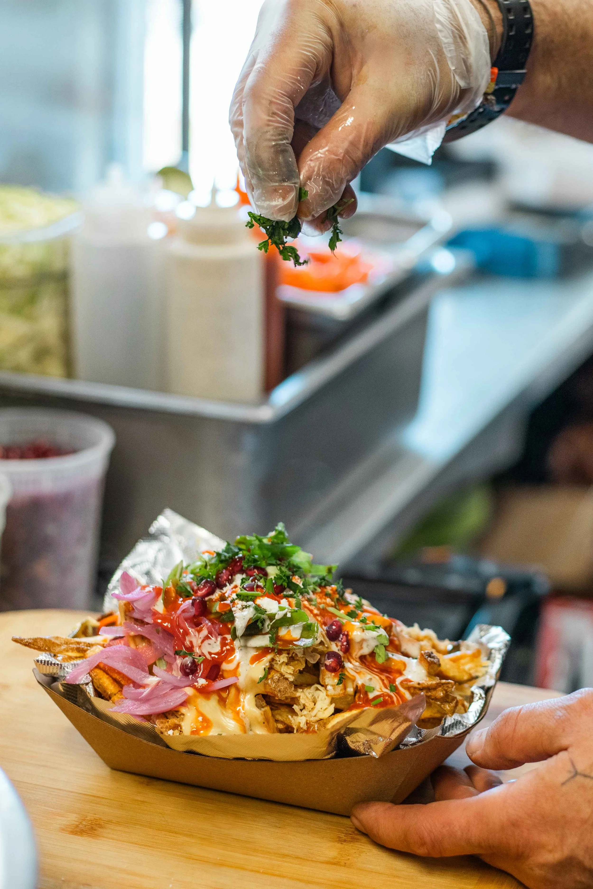
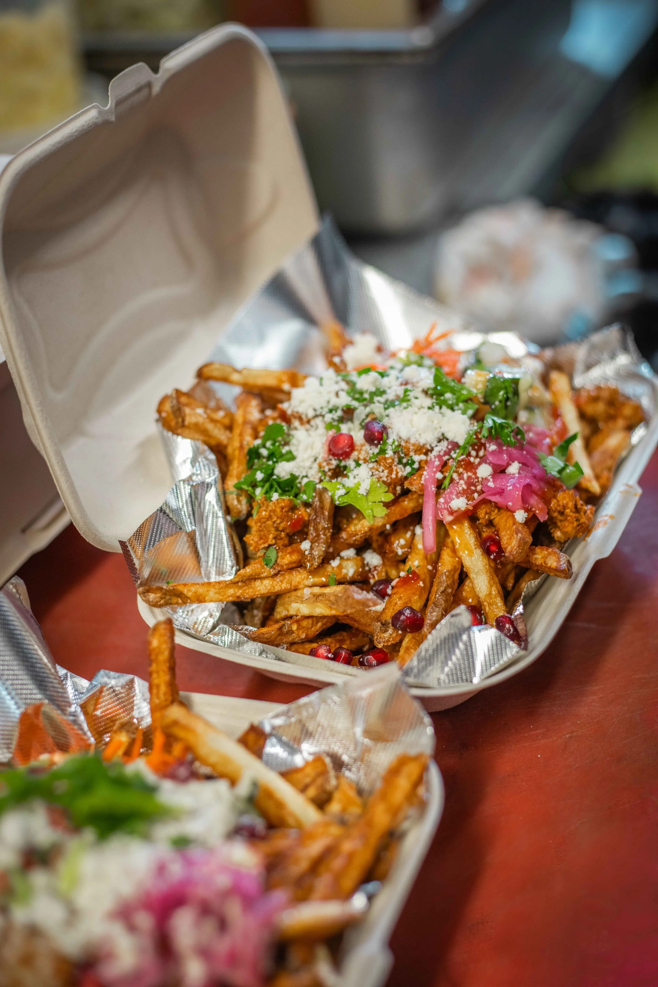
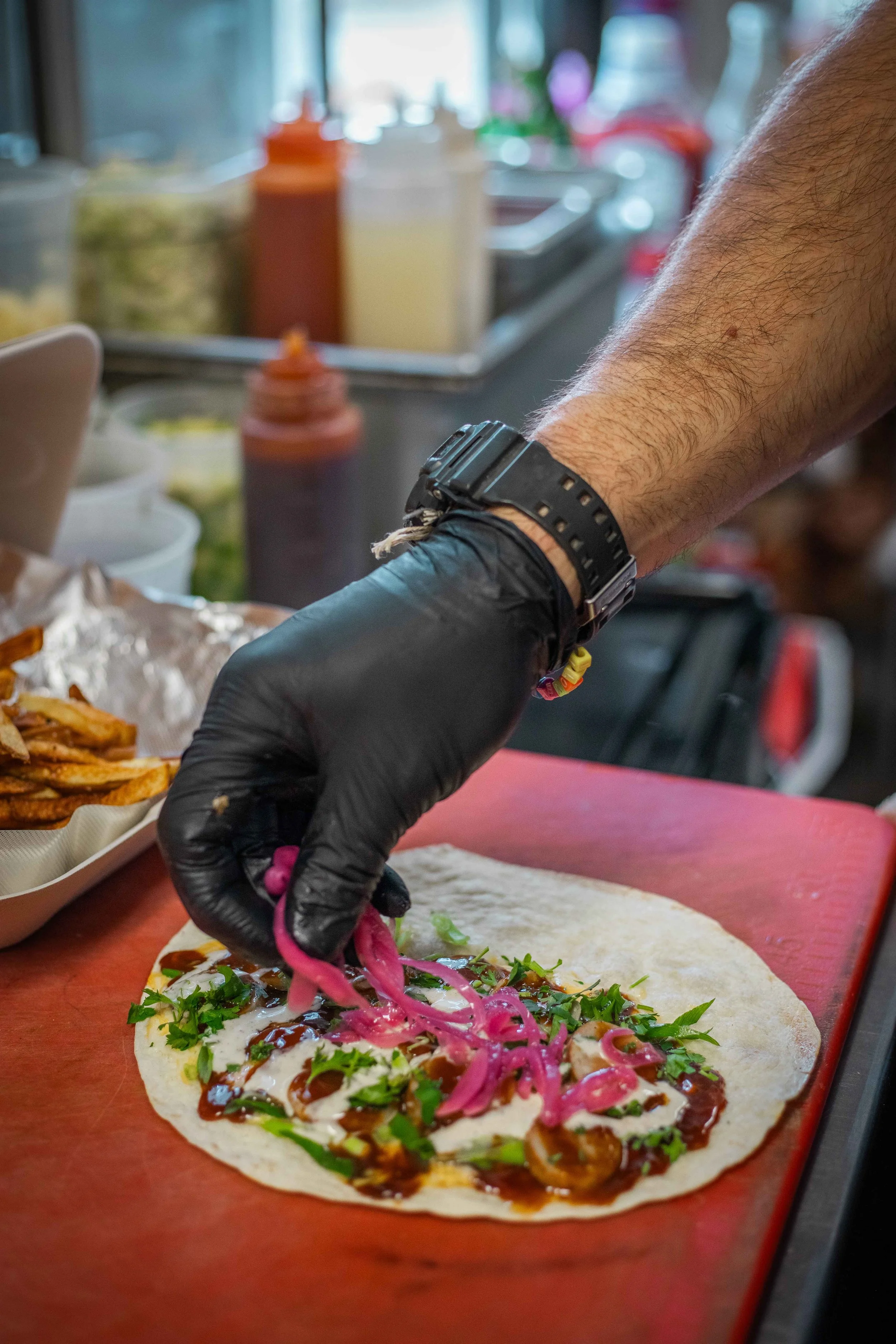
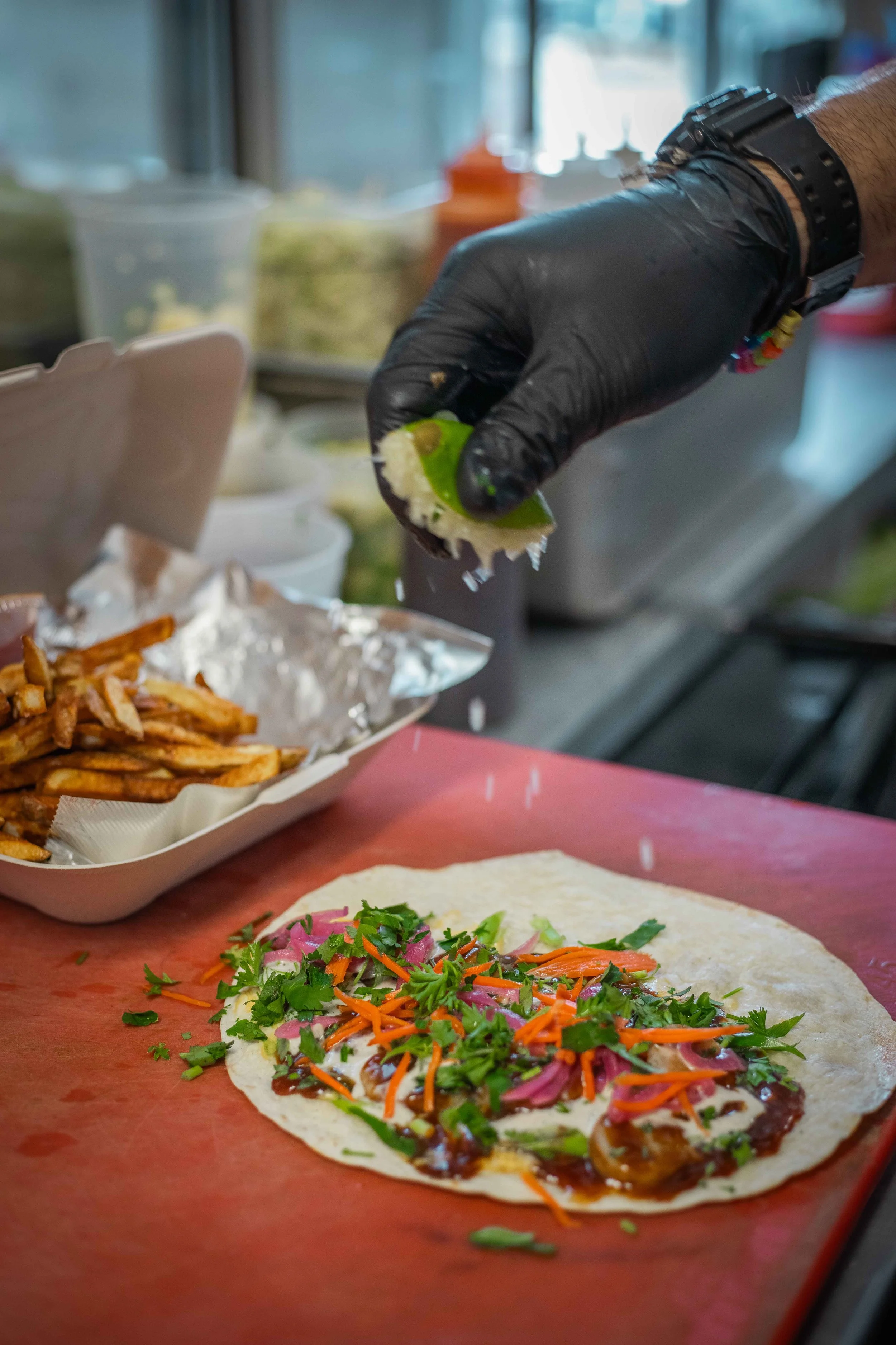
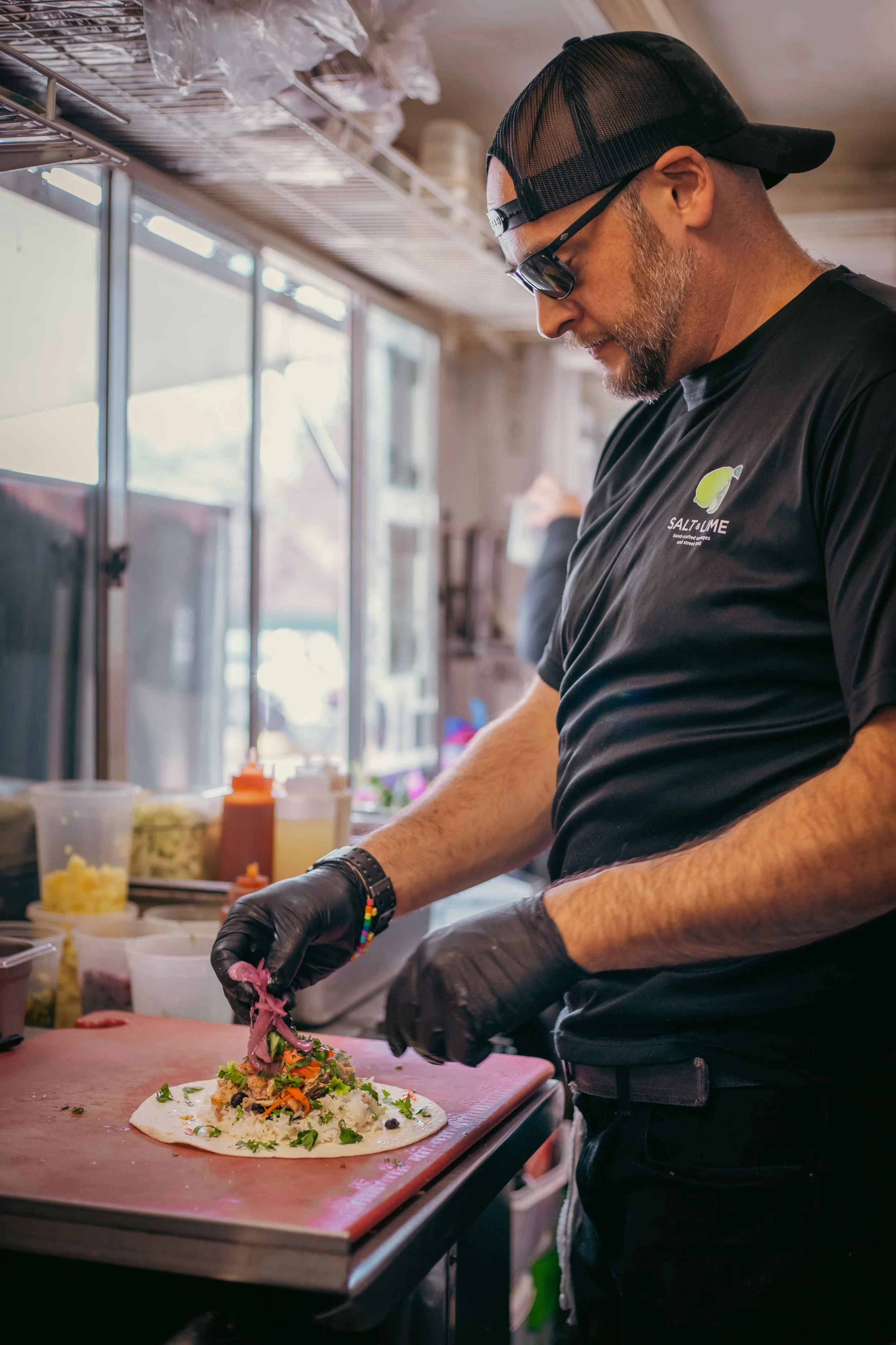
Objective: Create photography that supports brand positioning.
Through styled photoshoots, I developed a cohesive visual direction across food, space, and atmosphere. Lighting, composition, and tone were intentionally aligned with the brand identity to create imagery that could be used across web, social, and print collateral.
The result was a consistent visual library, not disconnected content.
-
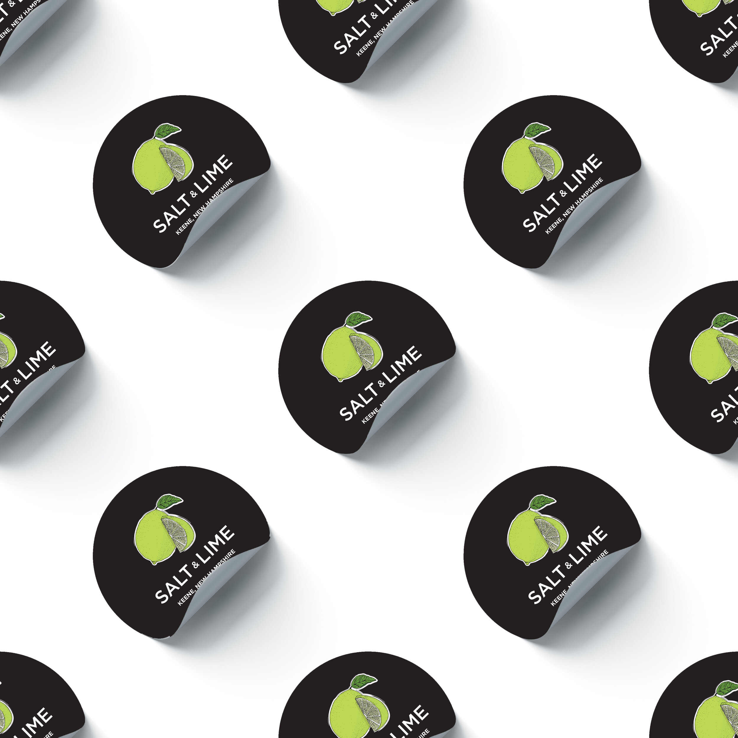
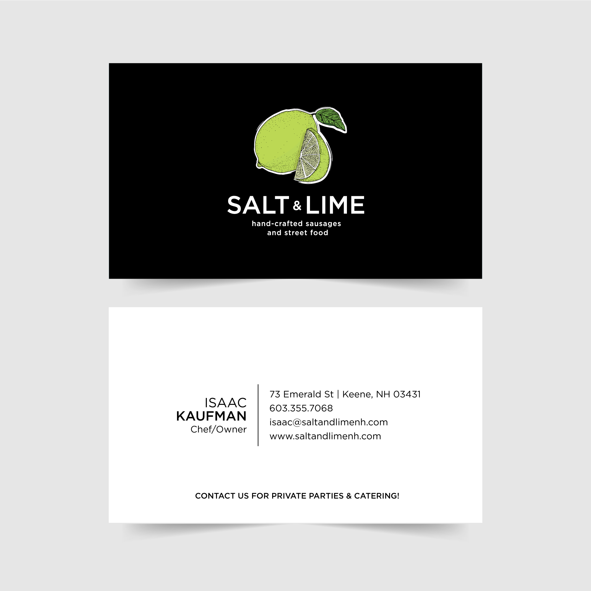
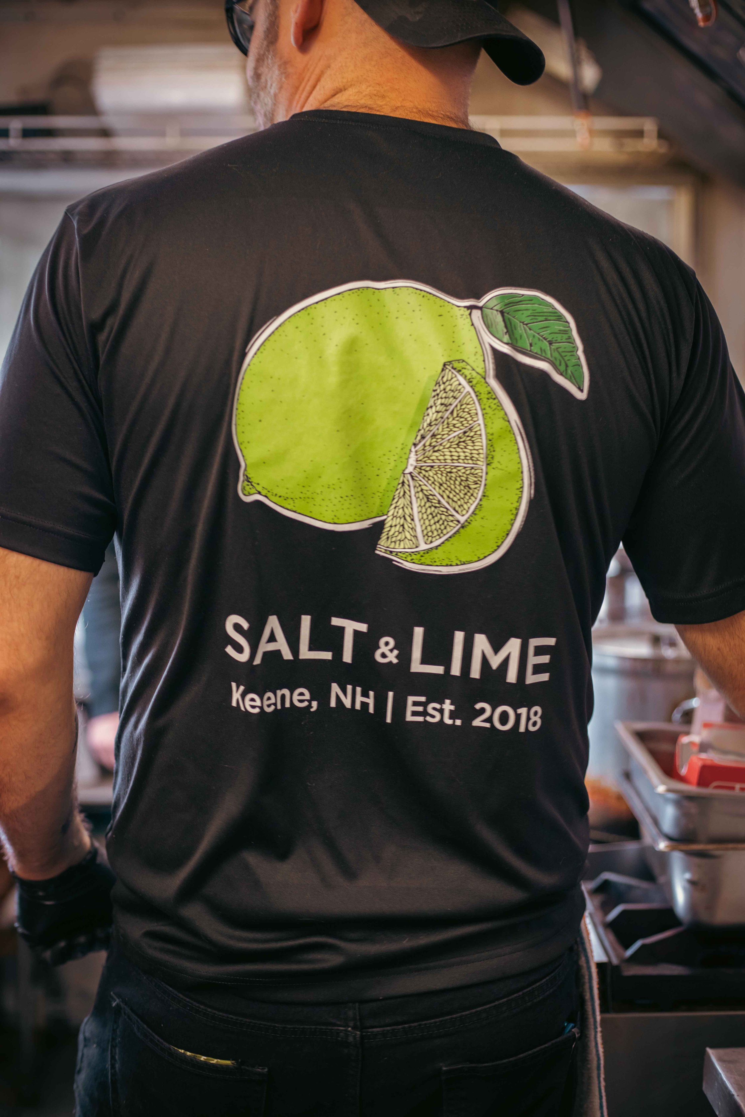
Objective: Ensure brand cohesion beyond digital.
I designed print collateral including menus and supporting materials that carried the same visual system established in the logo and website. Typography, spacing, and layout standards were applied consistently to strengthen recognition and professionalism.
The strategy was simple: every interaction should feel unmistakably Salt & Lime.
Strategy
Unify the Brand System
I aligned logo design, website experience, photography, and print collateral into one cohesive visual and verbal identity. Typography, color, tone of voice, and imagery were standardized to reflect Salt & Lime’s vibrant, confident personality across every touchpoint.
The focus was consistency, because consistency builds recognition and trust.
Elevate Brand Positioning
Rather than relying on generic restaurant language, I crafted messaging that highlighted experience, atmosphere, and flavor. Copy was designed to feel warm, inviting, and distinct, reinforcing what makes Salt & Lime more than just a place to eat.
The goal wasn’t more words, it was sharper identity.
Brand Voice
I built the website to mirror the brand’s energy while guiding users intuitively toward action. Layout hierarchy, photography placement, and copy structure were intentionally designed to create flow — from discovery to decision.
The digital experience wasn’t separate from the brand. It was an extension of it.
Centralize Creative Leadership
From logo development to photoshoots to print design, I led creative execution end-to-end. Styled photography, web design, menus, and collateral were developed within the same visual system to ensure cohesion.
Ownership created clarity.